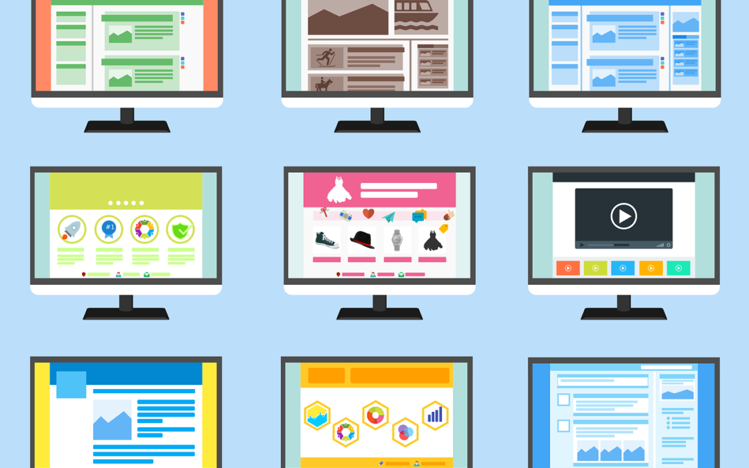
Within seconds, new website visitors choose whether to read the content and remain, or click away. To make a lasting first impression, examine the site design as carefully as you consider what to write. A well-designed website not only keeps visitors on your website, but it also generates trust for your brand and suggestions.
Consider the following suggestions when you create your website or blog.
Cost, quality, and convenience should all be considered
The cost of a fresh website design varies greatly. If you opt to have your site professionally built, you will receive a completely unique layout tailored to the precise needs of your blog or business—which may be just what you need. Remember that, in addition to paying expensive design costs at the outset, you will also need to pay for future development, updates, and adjustments.
Alternatively, many website building platforms provide free design templates that are simple to use and populate with information. WordPress powers many such websites and blogs and has thousands of premium (paid) and free themes to choose from.
You’ll want to make your site and brand stand out, so use the platform’s customisation capabilities to develop your own visual content design and brand style.
Of course, if you’re knowledgeable with web design, you may build your own style or modify an existing one to your satisfaction, resulting in a custom site without the financial investment. Make sure the template is up to date in order to take use of the most recent features when the CMS is updated.
Keep the design in line with your brand message
Consider how your site’s design components visually communicate your content. The theme of your website should be appropriate for your subject, from the design to the colours, fonts, and other particular aspects.
For example, it generally would not be a good idea to use a minimalist style for a gardening blog, or bright colours and fun typefaces for a law site.
Optimize the user experience for mobile
As a general guideline, your website should be simple to use and straightforward to read.
Consider the following:
- How simple is the navigation?
- Do guests always understand where they are?
- How simple is it to locate vital information?
- Are there too many or too few options for visitors?
- Are there any components that are unclear?
Because so many websites are now accessed via mobile devices, be sure yours is mobile-friendly. Most webpages are now responsive, which means they expand and shrink dependent on the resolution of each viewer’s device.
Create with monetisation in mind
If generating money through affiliate marketing is your primary aim, you must build your site to be merchandising-friendly. Allow visitors to easily navigate your site and discover suggestions linked to your stories and topics.
All material should be logically connected, which not only improves the visitor experience but also increases the effectiveness of affiliate links, advertising, and products.
Begin sharing
Remember that the initial layout and design can be improved over time. Begin with a modest, well-designed site and improve its design by adding fresh material and tracking where users are engaged.
Don’t waste time fussing over too many minute layout aspects. Instead, concentrate on components that will attract more visitors to your site.
Read


Recent Comments